T-Mobile | January 2022- March 2022
My role: UX Designer & Web Strategist
Tools: Figma
Demystifying device
swapping for business owners

Overview
T-Mobile for Business offers businesses an opportunity to bring their existing devices to the T-Mobile network. This allows employees to keep the device they already know and love, without changing their phone, which can be a learning curve for employees and costly to their employer.
While the benefit is valuable to business customers, the existing Bring Your Own Device page was not performing to benchmark. The overall page had a high bounce rate and low engagement.
My role in this project was to leverage usability testing data to make UX improvements to the page that will not only help future users but also positively impact KPIs. I was successfully able to do this by taking this problem space through the design thinking process which resulted in an increase in engagement, a decrease in bounce rate, and an overall improved user experience.

Problem statement
How might we help T-Mobile for Business customers feel confident in understanding the process of how to bring their existing phone(s) to T-Mobile while completing their transaction online on their own?
Challenges
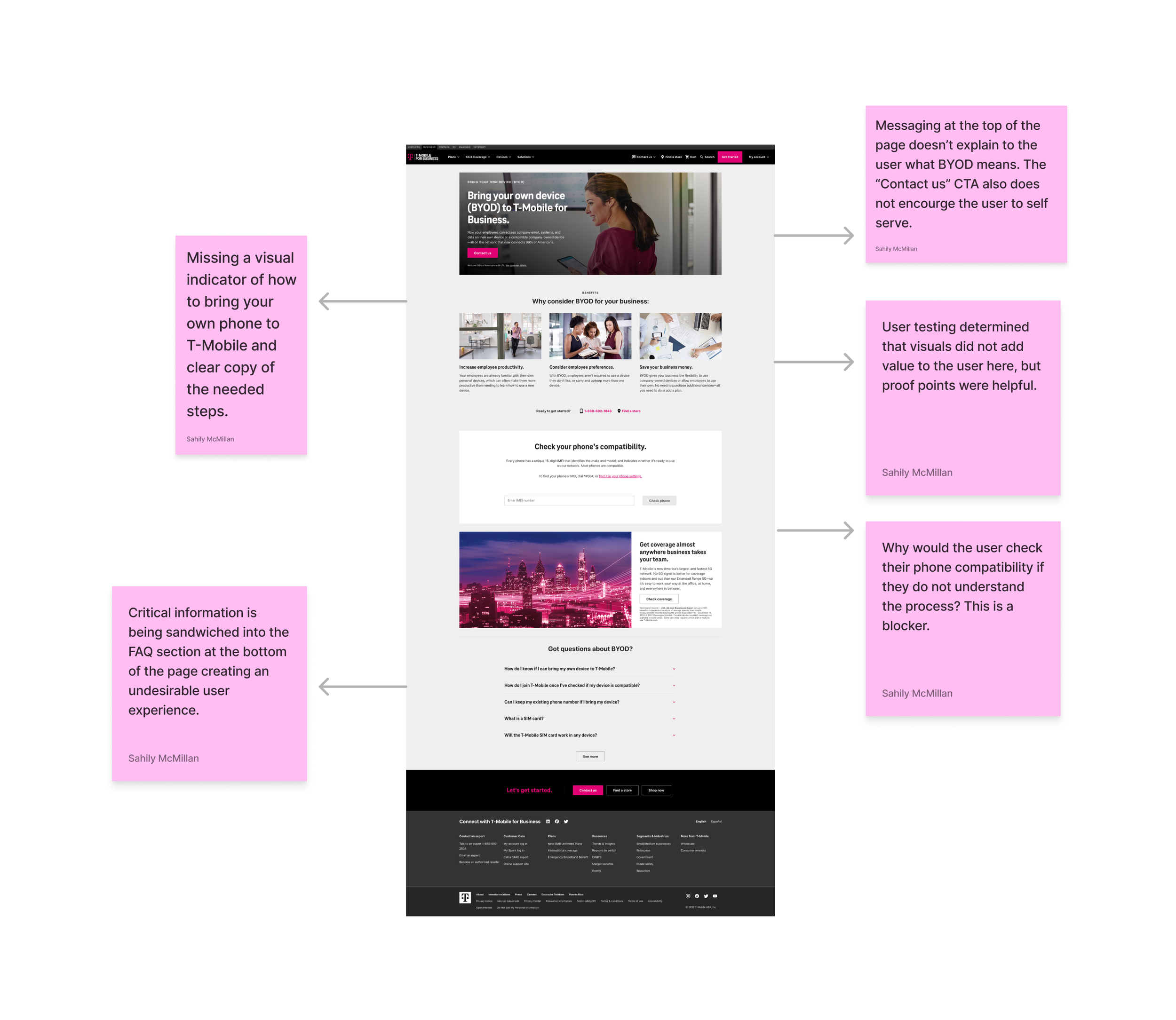
The existing user journey presents a challenge because it does not efficiently serve the end-user.
The landing page uses internal business language.
Clear step-by-step directions are not listed on the page.
Instructions on how to utilize the compatibility checker and self-serve are not present.
Opportunity
Revisit and update the current page experience to improve the information hierarchy of the page.
Focus on simple, user-friendly copy and remove internal jargon.
Provide visual cues for users and step-by-step instructions to understand the steps in how to bring their own device to T-Mobile.
Customer Journey
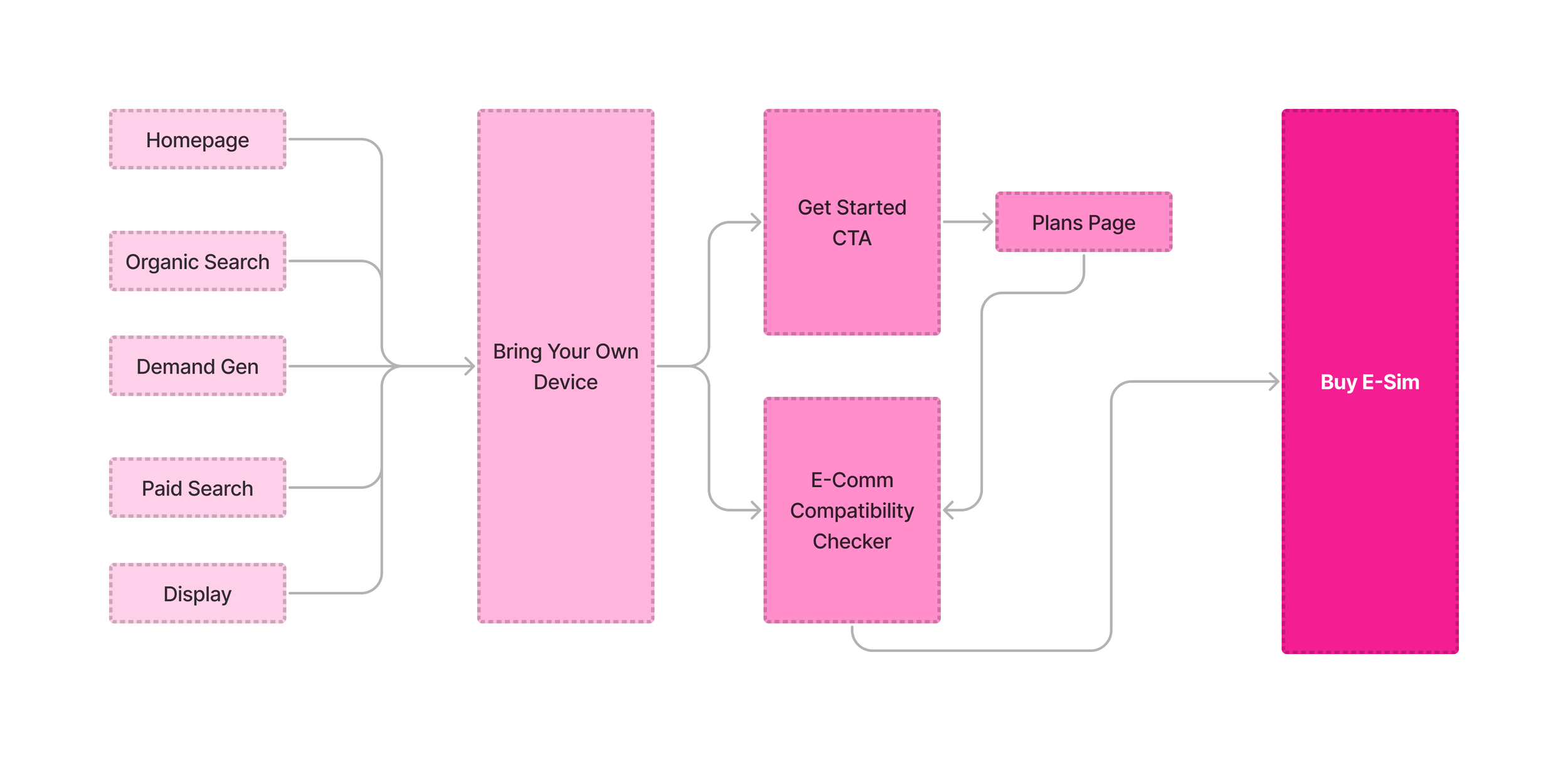
My first step in solving this problem space was creating a customer journey to visually map out and solve the existing pain points in the customer experience.
Wireframe
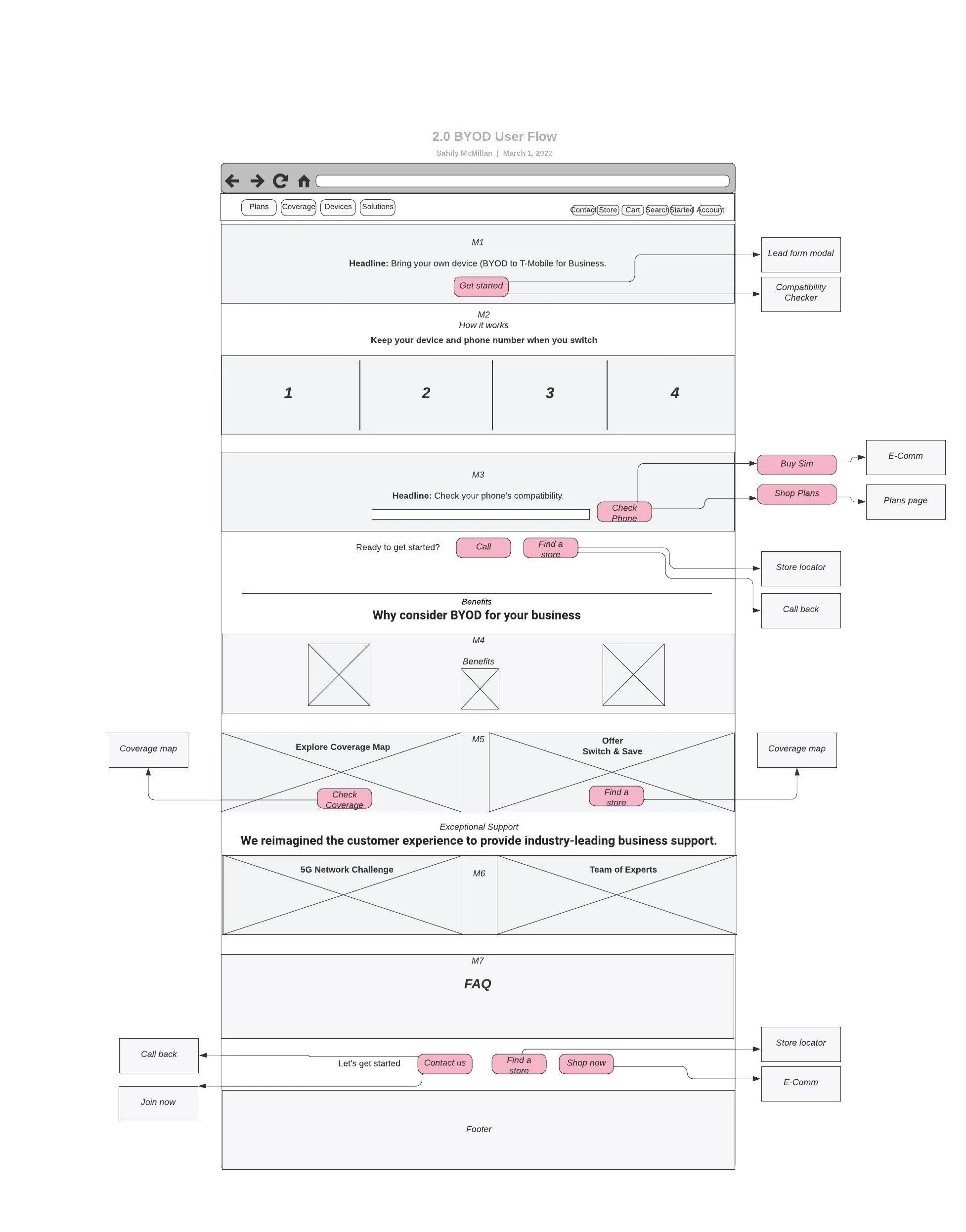
Using the insights I gathered from the user research and customer journey exercise, I built a wireframe that encompassed:
Bringing key information to the top of the page.
Visual cues of how many steps there are in the process.
Clear calls to action.
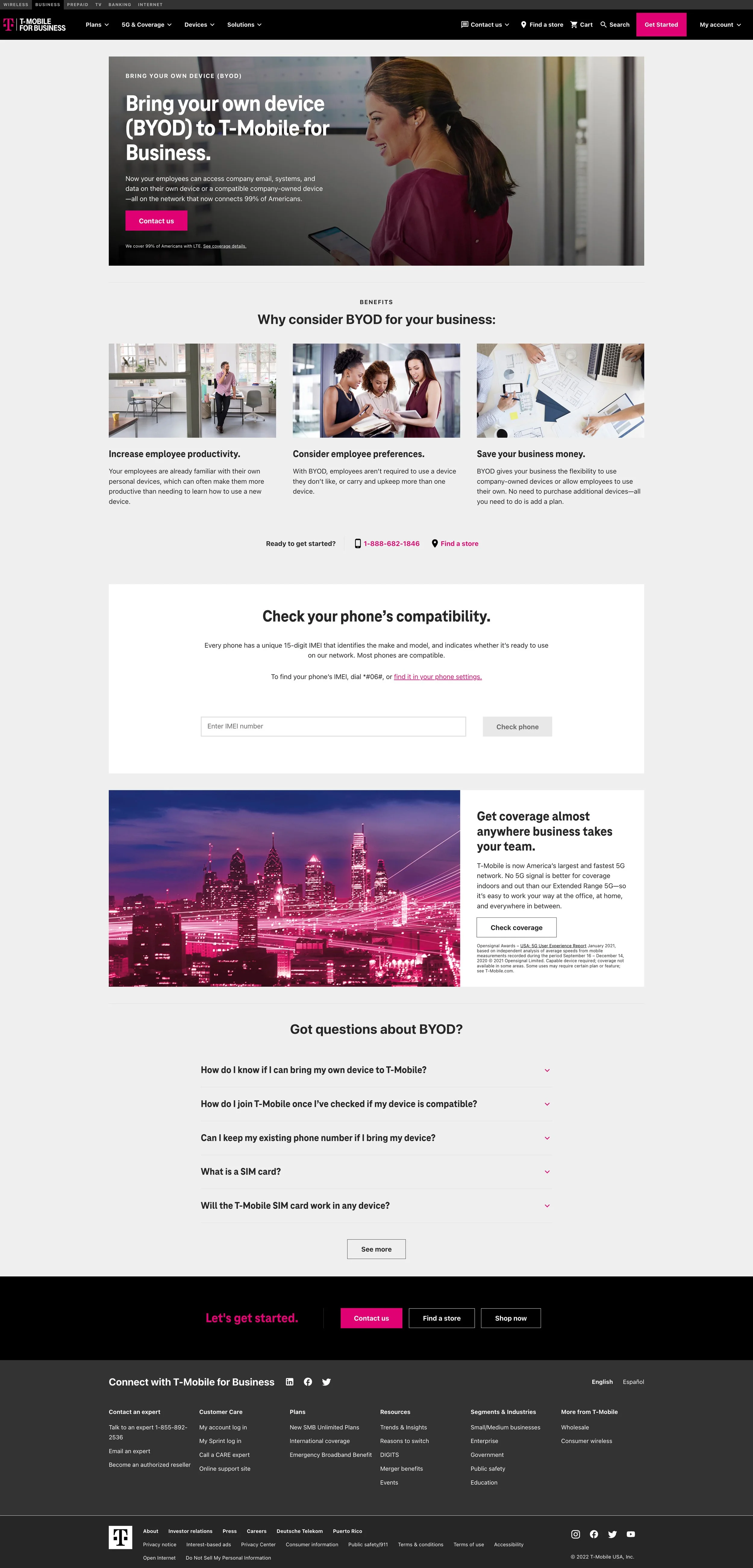
Before & After
Results
The new iteration of Bring Your Own Device landing page gives the end user all the information they need to bring their phone to T-Mobile. Upon arriving at the page, the user is able to see an easy-to-digest list of steps to learn how they can switch their device to T-Mobile. The user no longer has to scroll to the bottom of the page to dig for the answers they need. Instead, they are immediately guided to the first step in the process, which is checking their phone’s compatibility. All of this information is provided in simple language, which helps to build the user’s confidence in using this self-serve function.

Business Outcomes
-
Decrease in bounce rate
There has been a 3% decrease in bounce rate since the new landing page was launched.
-
The Compatibility Checker is the top performing module
What was once the lowest performing section, is now performing with an average engagement rate of 12%.
-
Decrease in FAQ engagement
The FAQ section engagement became one of the lowest-performing modules at 1.7%, indicating that users are now properly getting the information they need within the user flow.
Next Steps
Added visual elements
Explore the opportunity to add an infographic or video to the page to help users gain more insight into the steps needed to bring their device T-Mobile in a manner that visually demonstrates how easy it is.
Usability Testing
Conducting a second usability test to gather user feedback on if the updates address the user’s needs and determine if there are future opportunities for iteration.
