University of Washington | January 2022- June 2022
My role: UX Research & Designer
Responsibilities: User interviews, developing user flows, site maps, wireframes (low to high fidelity), prototyping, and usability testing
Tools: Mural, Balsamiq, and Figma
Making voting great again
Overview
As part of my User Experience & Visual Design certificate program at the University of Washington, I created a concept browser plugin to help Washington state voters with election misinformation. By having this resource, users can feel confident about consuming election information to make an informed decision when casting their ballot.
Problem Statement
How might we help Washington State voters to identify misinformation and bias when voting in elections?
User Research
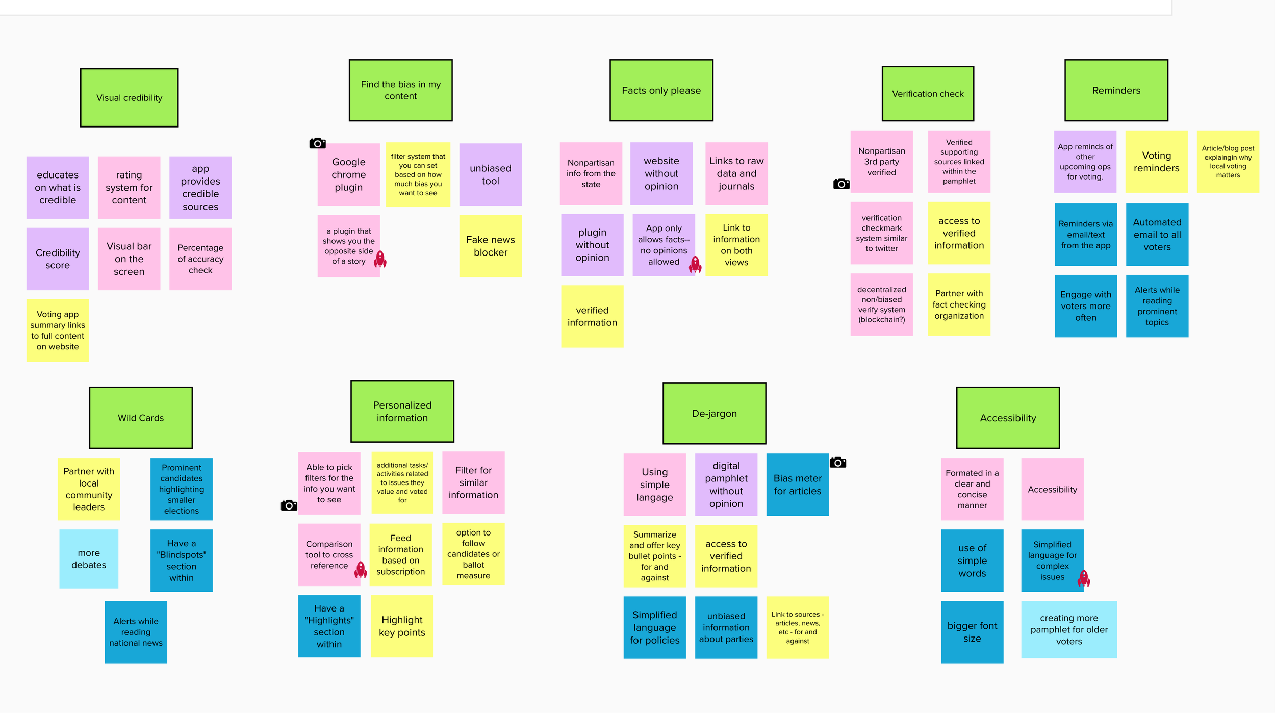
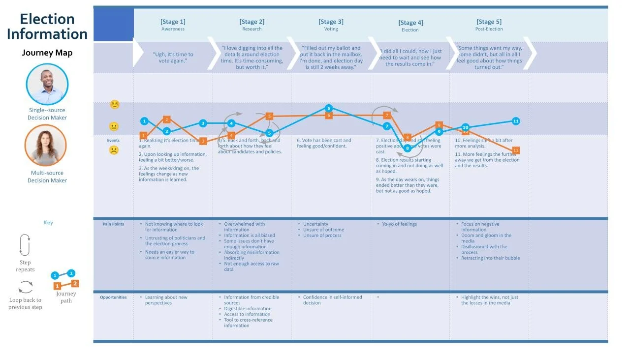
I conducted user research by interviewing 10 Washington State voters to learn about their experiences when voting. After collecting all of the information I created a comparative analysis to discover the pain points they each face during election season.
-
Problem Space
With so much information on digital platforms, it’s difficult for users to determine misinformation. Many online publishers also have a bias, and this further contributes to mistrust in information for voters who use the web to inform their voting decision.
-
The Solution
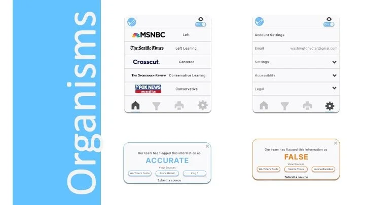
The Election Information browser plugin helps users feel assured in the information they find by using community moderators to verify information, as well as provide transparency into the bias of the content they are consuming.
Behavioral Archetypes
-

Single-source Decision Maker
“I may be skeptical about election information, but I trust my source to help me make the right choice.”
The single-source decision-maker wants to make a difference with their vote. They absorb election information from various sources, but ultimately they go back to their trusted source year after year because they feel confident that this source aligns with their core values.
-

Multi-source Decision Maker
“I like to be in control of my voting decision and do extensive reach before formulating my voting opinion.”
The multi-source decision-maker looks forward to submerging themselves into an election. They are open to new perspectives in helping them make a research-based decision to complete their civic duty as a voter.
Key Research Insights:
Election information makes voters feel overwhelmed.
Social media has added new complexity to navigating election misinformation and knowing who/what sources to trust.
Users feel that most news sources have bias, but knowing the bias upfront would help them know if they can trust the source.
Sorting through election information is time-consuming.
Usability Testing
Using the qualitative data I gathered from the 10 user interviews that I conducted, I created two low-fidelity examples to test with users.
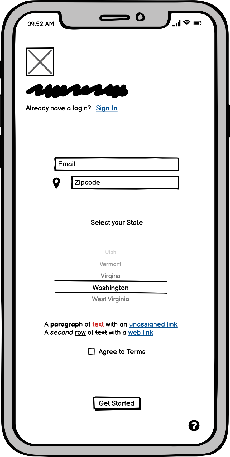
Onboarding experience: User information
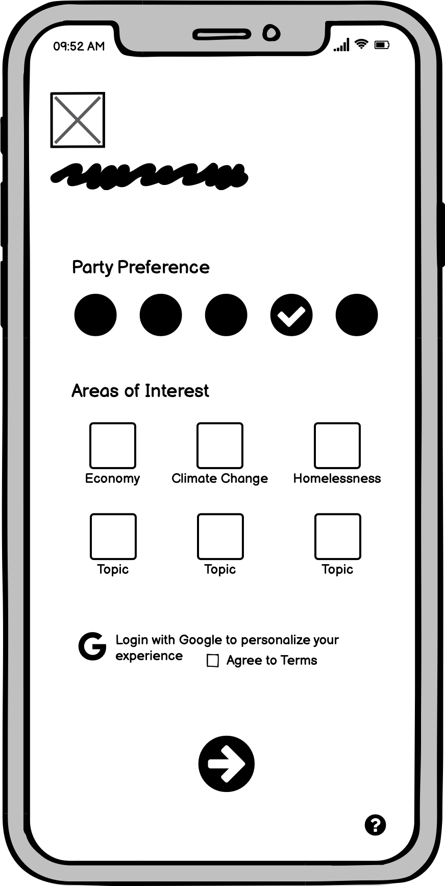
Onboarding experience: User customization
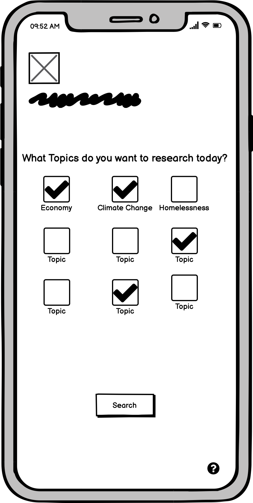
Home screen
Article feed
Article example
Article on news website
Reader view with simplified view

Misinformation identifier feature
Low-fi Wireframes
App Concept
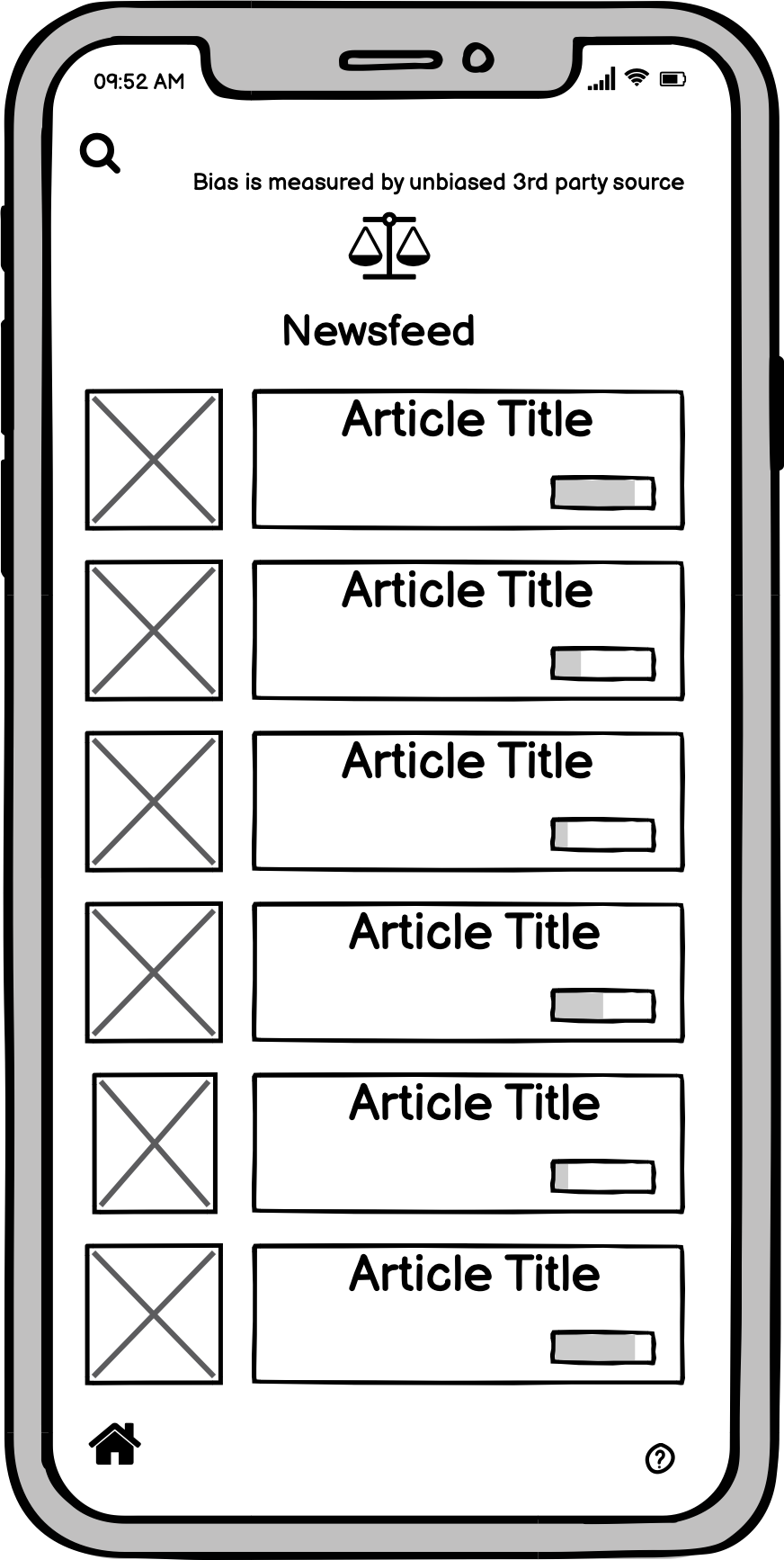
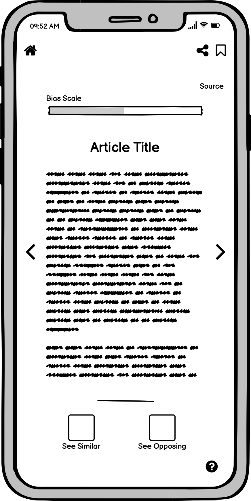
The app concept included key features that users expressed could help them when making a voting decision. Users felt that they needed a way to identify bias, and fact-check misinformation, while also having the opportunity to explore articles from viewpoints that may be different than their own. Once a user sets up a profile, they would be able to view articles based on their areas of political interest.
Browser Concept
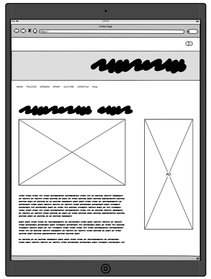
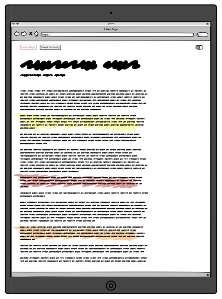
Many users expressed that they prefer to use their tablet or desktop computer when they are doing research. Leveraging the same features as the app concept, I also created a tablet version to show this concept could help with the readability of long-form content. This view also shows how a user can toggle the plugin on/off to consume content in a read-only mode which would simplify the content on the screen.
I conducted usability testing with 6 participants.
Concept Test Findings
-
Simplicity of a Plugin
The Election Information browser plugin is a “one and done” option that can be used across devices, vs having to download another app.
-
Bias and transparency is a key concern
Individuals want a strong sense of who determines bias (whether it’s people or AI), as well as an understanding of who defines what misinformation is.
-
Social sharing was not important to end users
With both concepts, end-users were not particularly interested in having a social sharing function, as they view these tools as modes of personal education.
-
Intuitive Design Choices
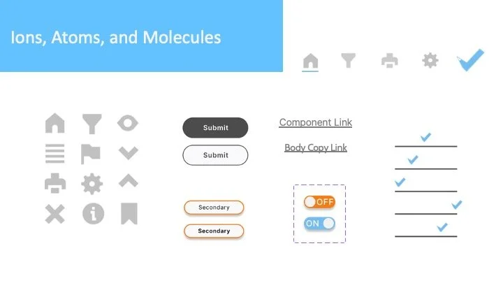
End users felt that the colors and icons selected for both concepts were user-friendly and easy to understand.
-
Data Concerns
End users were skeptical about using a Google integration with the tool in fear that their data will be sold or used for advertising purposes.
-
Accessibility
Designing for individuals of different abilities and taking things like colors and accessibility preferences as an option.
Next steps.
The usability test revealed that a browser extension would best solve the user’s pain points. While this option is a new concept to me, I was excited to take on the challenge of designing a browser plugin experience.
Iteration
User Flow
To better understand how a user will engage with the browser extension, I created a user journey of the key features within the plugin.
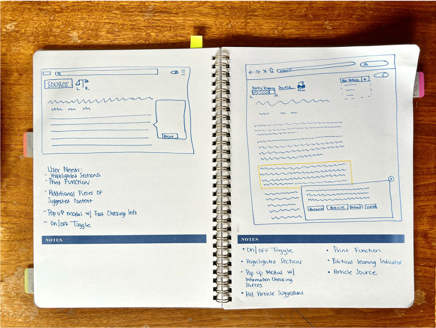
The drawing board
At this step in my process, I took all of the key features that the concept testing revealed with the user journey in mind and drew a sketch of how this may look as a browser extension.
Low-fi prototype
I created a low-fidelity prototype to share with users in my next round of usability testing. This prototype focused on key features of the browser extension.
Turning on/off the browser extension
Read-only view
Highlighted test to identify content accuracy
Bias indicator
Suggested articles
Print
Usability testing
I created a screener and had 10 people fill out the form. I selected 5 to take the usability test based on their responses and how likely they would be to use a browser plugin to inform their voting decision.
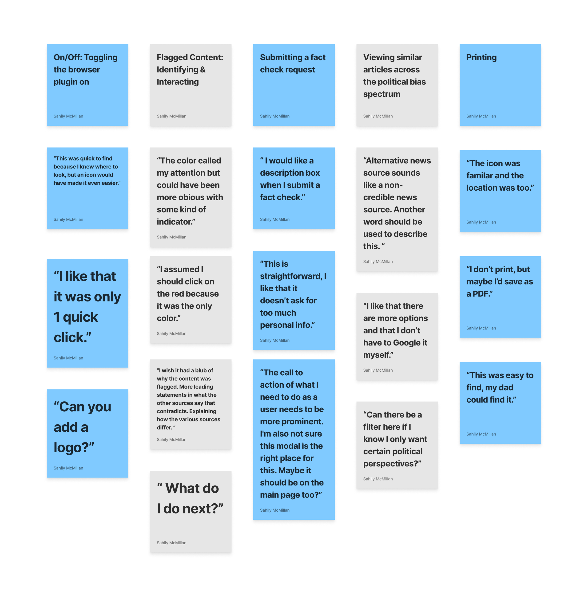
From there, I interviewed each user asking the same set of questions to better understand how users navigated the prototype, the features they were most interested in, as well as what aspects of my design caused the most frustration to users.
Results
• Many functions felt natural to users.
• Clear and concise UX copy would be helpful.
• Underlining highlighted content or finding a better way to make it stand out.
• Hesitation around color and how that could raise accessibility to concerns.
High fidelity design & prototype development
Prototype
What’s next from here?
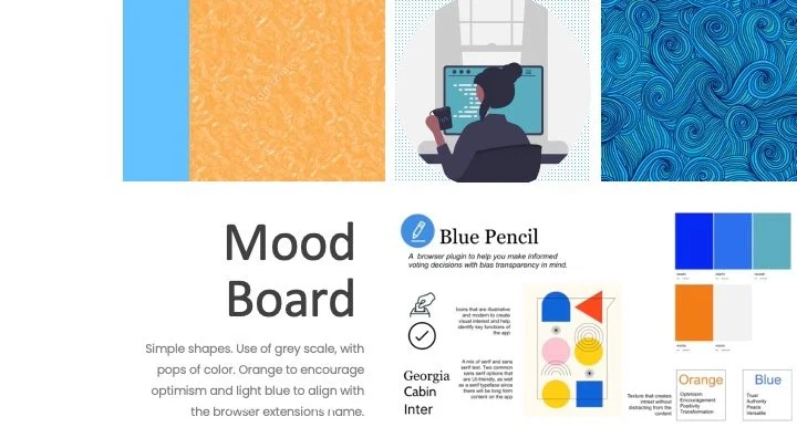
User testing the existing color palette to get an understanding of whether users feel that the colors have a political affiliation or if they feel that the colors are politically neutral.
Improving the design to make it more accessible and WCAG compliant.
Introducing an onboarding journey.

