Stanley Brand | November 2016- March 2017
My role: Web + Content Strategist
Tools: Balsamiq
Creating a digital-first experience
for a heritage brand
Overview
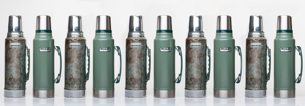
Stanley, the legendary brand founded by William Stanley in 1913, is owned by the Seattle-based brand Pacific Market International. While the heritage brand is a household name known for its “classic green bottle” that is sold in major outdoor retailers, the brand was working to establish itself in the digital realm with a new website and e-comm shopping experience.
In 2017, I was hired at Stanley as a content manager and was tasked with the project to lead the development of a blog for Stanley. The business goal was to build brand awareness and increase conversion on e-comm sales while creating a pleasant experience for both new and returning users. I was excited to take on this project because I had my own blog for over 7 years and was able to bring my personal learnings from designing blogs and content industry knowledge. I leveraged my prior knowledge and the design thinking process to create a customer-first web experience.

Problem statement
How might we help Stanley digital customers understand Stanley products by utilizing the company blog to find resources that will also build brand awareness and loyalty?
Challenges
Limited leadership buy-in and budget for building a brand blog, as brick and motor sales have historically been the key sales strategy for the company.
Research showed that existing Stanley customers would consider shopping online, but would need a reason to do so since they prefer in-store experiences.
Opportunity
With the launch of a new website, I could strategically build the blog experience into an omnichannel experience.
Help users understand the ways they can use their existing Stanley products while giving them easy options for purchasing new items.
Content that would drive customers from consideration down the e-comm funnel into conversion.
Approach & Strategy
-
User Journey
Identified ways to reach our audience and how to create a journey for the user from their entry point, down funnel from consideration to purchasing decision.
-
User Experience & Visual Design
Ensured that the blog was user-friendly and aligned with industry trends for outdoor consumer blogs.
-
Goals & KPIs
In order to know what was working and what was not, I formulated goals that encompassed marketing and e-comm goals objectives and KPIs to prove effectiveness.
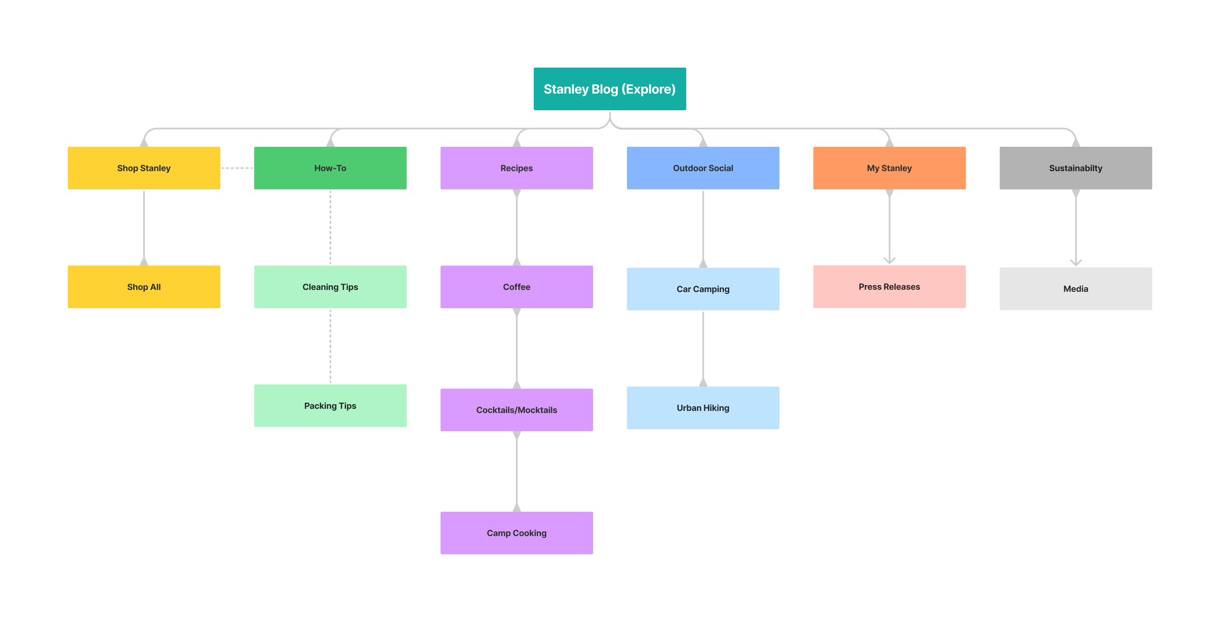
Information Architecture
I created a navigation experience and based the information architecture on common blog categories to help maintain consistency and user recall. I then conducted a tree test to ensure my approach resonated with users and adjusted the category titles based on my findings.
Design
I started off the design process by researching industry-leading branded blogs such as Patagonia’s “The Cleanest Line” and REI’s “Uncommon Path” to gather industry trends to provide a recognizable and intuitive experience for users.
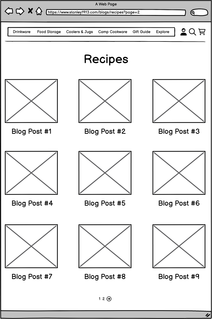
From there I designed the user experience for the following pages:
Blog landing page
Category pages
Article pages
As I worked to design a positive experience for users, I also kept the following business requirements in mind:
Backlinks to increase overall page visits
Product links
Opportunities to capture e-mail sign-ups
Social media links
Early Learnings
Increased Unique Monthy Visitors- The omnichannel approach to promoting blog content on social and e-mail campaigns instantly started to increase web traffic because the audience was interested in the content being shared on the blog.
Top Performing Posts- Recipes were top-performing posts month over month. With this data, I focused on creating additional recipe posts by partnering with the SEO team to use keyword research to identify the best content for our audience, products, and season as well as Google Analytics data from our website to identify additional content opportunities.
Business Outcomes
-
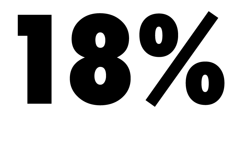
Increase of monthly web traffic
Within the first 6 months.
-

Increase in e-comm sales
Within the first 6 months of the blog being live.
What I would do differently
Consider an add-to-cart button
Rather than driving users away from the content, I would test adding an add-to-cart button to make the shopping experience easier and increase conversion.
Add relevant content links to articles
In an effort to keep users on the website longer, I would add links to similar content links to give users more content they may enjoy while increasing their site visit time and ideally the conversion rate.
